German designer Peter Schmidt died this summer aged 87. Lukas Cottrell, CEO of the Peter Schmidt group, pays tribute to his impact and enduring influence.
Nowadays when we talk about branding, it goes without saying that we mean a comprehensive view of communication. We no longer think of logos or digital platforms in isolation, but look at brand identity in an holistic way.
One of the first designers in Germany to understand this principle, and shape how it is applied, was Peter Schmidt.
With his work, he laid the foundations on which many branding strategies are still based today – and that is true far beyond the borders of Germany.
Peter Schmidt passed away in July at the age of 87. He leaves behind a creative legacy that reads like a catalogue of modern design history.
An holistic understanding of brand
Corporate design was a relatively new discipline in the Germany of the 1970s and 80s, and it was Peter Schmidt who defined the rules of the game. He approached design not as surface, but as strategic foundation.
For him, design was the architectural core of a brand, capable of generating recognisability, appealing to emotions, and building trust in equal measure.
One of his first works was also one of his most influential – a young fashion designer asked him to create a logo for her. Her name was Jil Sander.
The fact that she was able to establish herself as a fashion icon, make German fashion socially respectable, and build her reputation as the “queen of less” is also a result of the consistency with which Peter Schmidt shaped her into a brand.

He broke with all prevailing conventions right from the start, with the logo itself.
Instead of resorting to the usual clichés for frisky female fashion, he placed Jil Sander’s minimalist style at the centre of the design and took references from the headlines of the tabloid newspapers that were emerging at the time.
He developed a powerful wordmark in all caps that would remain unchanged for more than 50 years.
At the same time, however, Peter Schmidt was thinking beyond the logo to the product design. The perfume bottles he designed for Jil Sander became timeless icons. His most outstanding work in this area was Pure Woman, a simple creation comprising basic geometric shapes – a cube and a cylinder.
The product was so revolutionary that it ended up in New York’s MoMA.

Peter Schmdit was Germany’s best-dressed designer
Peter went onto established himself in the fashion and lifestyle segment. He recognised that fashion doesn’t work solely through garment collections, but by means of brand codes – visual markers that convey attitude, style, and lifestyle.
His flair for typography, materiality, and visual clarity made him one of the most significant designers for brands that introduced German fashion and lifestyle to the world. He played a decisive role in ensuring that brands like Joop! and HUGO BOSS were perceived as aesthetically sophisticated and internationally relevant.
His business associates appreciated Peter not only because of the work he did, but also because he shared their understanding of the power of fashion.
Wolfgang Joop described him as “Germany’s best-dressed designer.” His co-workers recall that he meticulously noted what he wore to each client meeting, to make sure he never showed up in the same outfit twice.
Peter Schmdit: “Aesthetics without ethics is cosmetics”
His success in the field of lifestyle branding made Peter Schmidt a sought-after partner in other industries as well.
His passion for making the world a better place through design extended to every area of life, from product brands to stage sets, from books and magazines to everyday consumer goods.

His Form 2026 tableware for Arzberg is an aesthetic classic. An appealing interplay of basic geometric shapes. A combination of contrasting forms that simultaneously create tension and harmony. Pure and reduced to the essentials.
And the bottle he designed for Apollinaris also set new standards. It recalls the design language of a jug while at the same time alluding to the purity of flowing water. Above all, however, its design created added value.
Suddenly it made sense that an iconic bottle available only in restaurants was more expensive than comparable products available in supermarkets.
It is also true that anyone who shapes brands, products, and experiences across all industries leaves a lasting impression.
“Peter Schmidt drove the boring conventionality out of German companies,” wrote journalist Joachim Schirrmacher.
Peter himself was keenly aware of the social leverage of design. “You can kill people with ugliness, just like you can with an axe,” he maintained. But also – almost poetically – he believed, “Aesthetics without ethics is cosmetics.”

Taking German design to the international stage
Peter Schmidt’s work puts him on a par with design icons like Massimo Vignelli, Raymond Loewy, and Paul Rand.
Just as these designers shaped the understanding of brands in the USA and Italy, Schmidt fulfilled a similar role in Germany, defining German design on the international stage as precise, clear, and impactful.
Peter Schmidt elevated German brands to global awareness. He proved that good design is more than just visual form – it is cultural capital that creates trust, recognisability, and desirability.
This makes him not only a pioneer of German branding, but an icon of international design whose influence extends beyond his lifetime.
Would he have been uncomfortable with this assessment? Probably, because although his designs reliably attracted attention, Peter remained a man of few words.
He was not interested in volume, in being loud, but in making an impact. The focus was always on the idea, not the designer.
Those who got to know him were usually surprised how shy and reserved he could be. Even in meetings, you always had to listen closely so as not to miss a word or a thought.
Colleagues once asked him what he wanted to leave behind for posterity. “I don’t care,” he replied, knowing full well that nothing lasts forever and that life is a constant state of change.
Continuing Peter Schmidt’s legacy
But we, his colleagues, did care.
It is important to us to continue working in his spirit. After all, the Peter Schmidt Group he founded not only bears his name, but many employees have absorbed his philosophy for decades – straightforward elegance, holistic design, precision and timelessness.
Meaningful aesthetics that not only serve themselves, but always follow a purpose. This approach has made the agency successful. It is now one of the largest in Europe, with offices in Germany, Portugal, Italy and Japan.
In addition to anchoring his ideas in our work, we also want to ensure that Peter Schmidt remains visually present in our creative community and continues to shape the agency’s image.
That’s why, a few years ago, we developed our new corporate typeface on the basis of his handwriting.
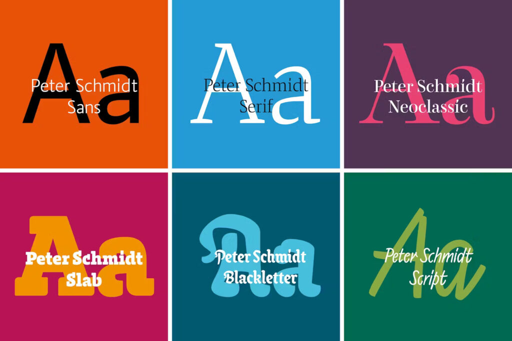
During a workshop Peter Schmidt, focused and immersed in the task at hand, used three different dip pens to write words like “Walküre,” “Hamburg,” “Trommelwirbel,” and “Elephant” – we needed every letter of the alphabet in his personal style.
Surprisingly, no two letters were alike. Every word was different – new and surprising each time. We almost suspected Peter was just trolling us. Or perhaps he didn’t want to be pinned down so easily?
Nevertheless, it was obvious what typified his handwriting – it was his versatility.
The many nuances and subtle details. An unexpectedly long stroke above every “i.” A surprising flourish on the “o.” The special features are manifold and found in every detail.
Today, the font is installed on every computer in the agency, so a part of Peter Schmidt’s personality is still shaping our communication and will continue to the future.

Article by Lukas Cottrell in Designweek